Hint
Node installation is mandatory for every platform and also, the Android platform requires Java and Android SDK installation. All of is available on this link
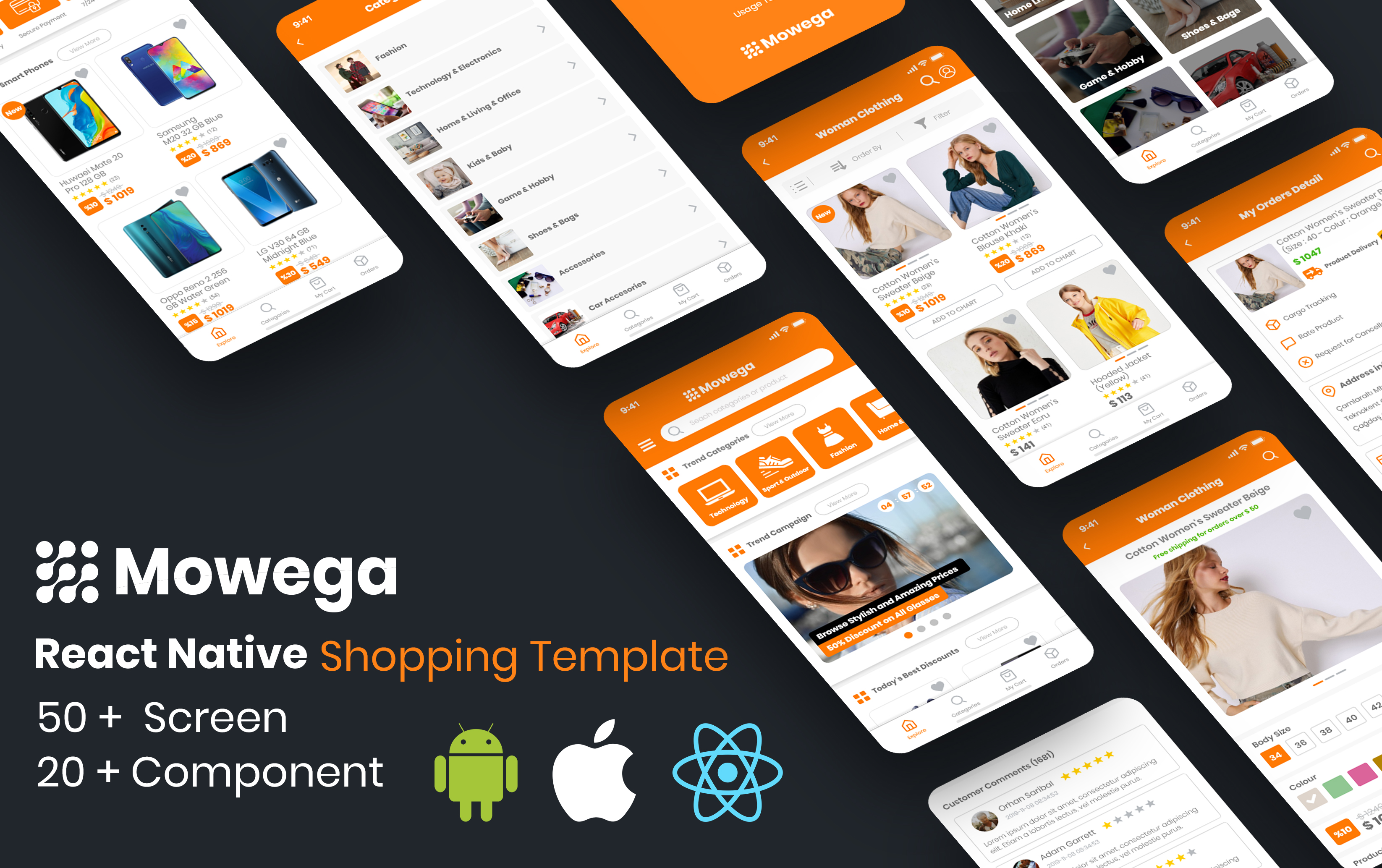
All needs in the MowegaShop e-commerce area have been considered. The tools used have been made completely unique and have been used to increase ease of use and project management.
The theme comes with React Native 0.59.10 version that is already installed. It is currently the most stable version for this project. For versions 0.60 and above, some plugin problems can occur.
With react-native run-android command, you can install the app to your device or emulator.
With
If you want to install a higher version from the beginning, you must install React Native first.
Go to last version documentation fromhere.
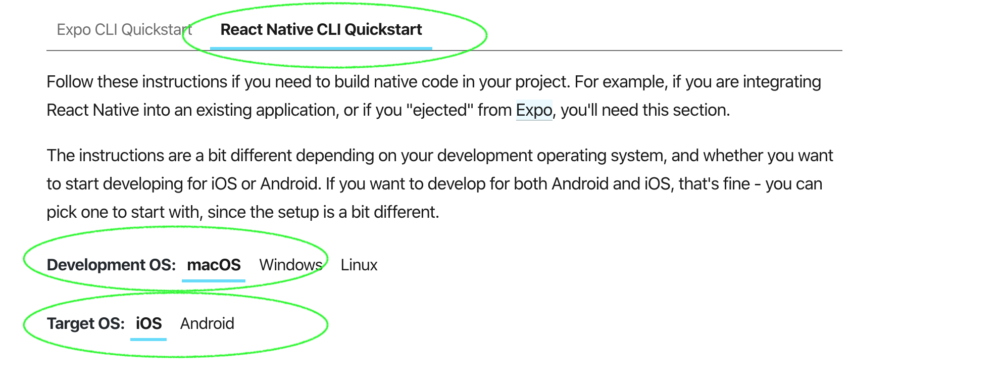
As shown in the picture above, we need to setup as React Native CLI Quickstart, not Expo option. MacOS platform is mandatory if Target OS is iOS. For android, macOS, Windows and Linux are available.
Node installation is mandatory for every platform and also, the Android platform requires Java and Android SDK installation. All of is available on this link
After React Native installation, with npx react-native init AwesomeProject --version X.XX.X (this command is available on the React Native document page) command, need to create new project.
The package name is com.mowega.mowshoptheme. You can change this Var olan paket com.mowshoptheme paket adı ile gelmektedir. You should replace it with a suitable package name.
Install this plugin from here
react-native-rename "Your App Name" -b test.company.yourname with this command, you can change easily.
The second way is deleting android and ios folder. After deleting these folders, you need to change name and displayName fields
{
    "name": "MowShopTheme",
    "displayName": "MowShopTheme"
}
With the second method you can only make package names starting with com. For example, if the name is MowShopTheme, your package name is com.mowshoptheme.
For the theme to work fully, plugins must be installed.
"dependencies": {
            "react": "16.6.3",
            "react-native": "0.59.10",
            "react-native-collapsible": "^1.4.0",
            "react-native-countdown-component": "^2.6.0",
            "react-native-datepicker": "^1.7.2",
            "react-native-device-info": "^2.3.2",
            "react-native-easy-toast": "^1.2.0",
            "react-native-indicators": "^0.13.0",
            "react-native-keyboard-aware-scroll-view": "^0.8.0",
            "react-native-localization": "^2.1.6",
            "react-native-orientation": "^3.1.3",
            "react-native-popup-dialog": "^0.17.0",
            "react-native-responsive-screen": "^1.2.2",
            "react-native-restart": "0.0.13",
            "react-native-snap-carousel": "^3.8.4",
            "react-native-star-view": "^1.1.3",
            "react-native-status-bar-height": "^2.2.0",
            "react-native-swiper": "^1.5.14",
            "react-native-vector-icons": "^6.1.0",
            "react-navigation": "^2.18.3",
            "sync-storage": "^0.3.0"
            }
Above is the list of installed plugins in the package.json file. You need to install these plugins.
react-native-countdown-component Go to plugin page
react-native-datepicker Go to plugin page
react-native-datepicker Go to plugin page
react-native-easy-toast Go to plugin page
react-native-indicators Go to plugin page
react-native-keyboard-aware-scroll-view Go to plugin page
react-native-localization Go to plugin page
react-native-orientation Go to plugin page
react-native-popup-dialog Go to plugin page
react-native-responsive-screen Go to plugin page
react-native-restart Go to plugin page
react-native-snap-carousel Go to plugin page
react-native-star-view Go to plugin page
react-native-status-bar-height Go to plugin page
react-native-swiper Go to plugin page
react-native-vector-icons Go to plugin page
react-navigation @"^2.18.3" Go to plugin page
sync-storage Go to plugin page
Our advice is to throw all the plugins into the package.json as json and then run the npm install command
En önemli core component. Bütün sayfaları bunun içine alıyoruz.
| Prop Name | Prop Type | Default Value | Other Values | Description | |
|---|---|---|---|---|---|
| statusBar | boolean | true | true, false | to show statusbar. | |
| title | string | null | "Test Title" | Sayfadaki navbar üzerinde görünecek başlık. Görünmesi için navbar={true} olmalıdır. | Page navbar title. Required navbar true |
| navbar | boolean | true | true, false | to show navbar | |
| footer | boolean | true | true, false | to show footer | |
| footerActiveIndex | Enum | 1 | 1,2,3,4 | index for detecting selected index |
    <MowContainer
        title={"Categories"}
        footer={true}
        navbar={true}
        statusBar={true}
        footerActiveIndex={2}

    >

        Other Components

        </MowContainer>
This component is inside the MowContainer. No need to change. If you want to change it anyway, you can find it inside container.
All of react native TextInput props can use. You can access all of these from here You can find additional props below.
| Prop Name | Prop Type | Default Value | Other Values | Description | |
|---|---|---|---|---|---|
| type | Enum | text | text , textarea, number | It creates input-style structure in html | |
| passwordInput | boolean | false | true, false | Girilen yazılan gizlenir. Html deki password alanı gibidir. Aynı zamanda ototamik sağ tarafa göster gizle ikonu yerleştirir. | to hide entered text. It's kind of html password field and there is also show/hide icon on the right. |
| leftIcon | string | null | All vector icon | Adds an icon to the left side of the input. Requires Vector Icons plugin. |
|
| rightIcon | string | null | All vector icon | Adds an icon to the right side of the input. Requires Vector Icons plugin. |
|
| rightIconOnPress | function | null | null | to assign a function when click the right icon | |
| iconColor | string | theme mainColor variable | all colors | changes icon color. | |
| containerStyle | style object | null | null | to change input container ui | |
| textInputStyle | style object | null | null | to change textInput ui | |
| placeholder | style object | null | null | placeholder text . |
    <MowInput
        type={"number"}
        passwordInput={false}
        leftIcon={"user"}
        rightIcon={"map"}
        rightIconOnPress={() =>{}}
        iconColor={"red"}
        maxLength={1}
        textInputStyle={{padding:5}}
        containerStyle={{position:absolute;left:0}}
    />
A plugin that to work picker. You can setup easily from here. You can edit the component according to the documentation
| Prop Name | Prop Type | Default Value | Other Values | Description |
|---|---|---|---|---|
| defaultValue | string | null | null | default date |
    <MowDatePicker
        defaultValue={"2019-12-01"}/>
You can find required plugin from here. The global variable is used in this component. It comes in a way that is installed in MowContainer. To use this component, global.__loadingThis.loadingText = "Loading..."; global.__loadingThis.showLoading = true; like this.
    let loadingBall = global.__loadingThis;

    constructor(props){
        super(props);

        loadingBall.loadingText = "Loading...";
        loadingBall.showLoading = true;
    }

    componentDidMount () {
        loadingBall.showLoading = false;
    }
| Prop Name | Prop Type | Default Value | Other Values | Description |
|---|---|---|---|---|
| title | string | null | null | list title |
| titleTextStyle | style object | null | null | to change title style |
| subtitle | string | null | null | sub title that below the title |
| subtitleTextStyle | style object | null | null | to change sub title style |
| imagePath | require('path') | null | null | list item image that appears the left of the view |
| iconName | Fa icon (string) | null | null | Right side > icon. It can change from here. |
| selected | boolean | null | true, false | If you want to set as selected when clicked/touched |
    <FlatList
            showsVerticalScrollIndicator={false}
            keyExtractor={(item, index) => index.toString()}
            data={CategoriesData}
            style={[pageContainerStyle]}
            renderItem={({ item, index }) => (

                // category item
                <MowListItem
                    key={index}
                    style={{marginVertical: 5, borderRadius: 5}}
                    onPress={() => {  ... when clicked  }
                    imagePath={item["image"]}
                    title={item["title"]}/>

            )}
    />
| Prop Name | Prop Type | Default Value | Other Values | Description |
|---|---|---|---|---|
| title | string | null | null | list title |
| titleTextStyle | style object | null | null | to change title style |
| subtitle | string | null | null | sub title that below the title |
| subtitleTextStyle | style object | null | null | to change sub title style |
| imagePath | require('path') | null | null | list item image that appears the left of the view |
| iconName | Fa icon (string) | null | null | Right side > icon. It can change from here. |
| selected | boolean | null | true, false | If you want to set as selected when clicked/touched |
    <FlatList
            showsVerticalScrollIndicator={false}
            keyExtractor={(item, index) => index.toString()}
            data={CategoriesData}
            style={[pageContainerStyle]}
            renderItem={({ item, index }) => (

                // category item
                <MowCheckListItem
                    key={index}
                    style={{marginVertical: 5, borderRadius: 5}}
                    onPress={() => {  ... when clicked  }
                    imagePath={item["image"]}
                    title={item["title"]}/>
            )}
    />
| Prop Name | Prop Type | Default Value | Other Values | Description |
|---|---|---|---|---|
| modalVisible | boolean | false | true,false | Open/Close Modal |
| onClosed | function | null | null | IMPORTANT! when onClosed, in which page you call modal, you must set the modal opening state parameter to false in the state of that page. This is important when use two modal in one page. |
    <MowModal
            onClosed={() =>{ this.setState({pageModalVisible: false})}} // IMPORTANT
            modalVisible={this.state.pageModalVisible}
                >

                    <View style={{padding:gPadding}}>

                        <MowInput placeholder={"Start price"}/>

                        <MowInput placeholder={"End price"}/>
                    </View>
    </MowModal>
| Prop Name | Prop Type | Default Value | Other Values | Description |
|---|---|---|---|---|
| modalVisible | boolean | false | true,false | Open/Close modal. |
| onClosed | function | null | null | IMPORTANT! when onClosed, in which page you call modal, you must set the modal opening state parameter to false in the state of that page. This is important when use two modal in one page. |
| pickerTitle | array | null | null | When picker opened, it shows as picker title |
| search | boolean | true | true, false | to enable search bar |
| data | array | null |
|
data that will list inside picker |
| valueKey | string | id | null | selected picker value |
| textKey | string | title | null | selected picker value key |
| selectedValue | number | null | null | When the picker is turned on, it is used to keep an item selected. |
| onSelect | function | null | null | when selection is made, returns the clicked data as json. |
    <MowPicker
        key={2}
        pickerTitle={"Test"}
        selectedValue={this.state.pickerSelectedId}
        onSelect={(obj) => {this._onSelect(obj)}}
        title={mowStrings.picker.sort.title}
        search={false}
        modalVisible={this.state.pickerVisible}
        onClosed={() =>{this.setState({pickerVisible: false})}}//IMPORTANT
        data={pickerSortData}/>
You can find required plugin from here. The global variable is used in this component. It comes in a way that is installed in MowContainer. To use this component, you can follow below code blocks. This component is used by calling the function.
| Arguments | Data Type | Default Value | Other Values | Description |
|---|---|---|---|---|
| title | string | "" | Dialog Title | |
| message | string | "" | Dialog Description | |
| bpt | string | "OK" | ButtonPositiveText. Positive button text | |
| bnt | string | "Cancel" | ButtonNegativeText. Negative button text | |
| twoButton | boolean | false | to show both positive and negative buttons. |
    _warningDialog("Mowega Shop Theme", "Message",null,false);

    _successDialog("Mowega Shop Theme", "Message","OK","Cancel",true);

    _errorDialog("Mowega Shop Theme", "Message","OK",null,false);

    _defaultDialog("Mowega Shop Theme", "Message","OK",null,false);
| Prop Name | Prop Type | Default Value | Other Values | Description |
|---|---|---|---|---|
| checked | boolean | false | true, false | Set checkbox as selected. |
| containerStyle | style object | null | null | Changes container style. |
| checkedColor | string | mainColor | null | Set checkbox selected color. |
| onPress | function | null | null | Function that required for each click operation. |
| boxSize | integer | hp(2.5) | null | It is recommended to give according to the screen ratio. |
     <MowCheckBox
             onPress={() => {this._onPress()}}
            checkedColor={mowColors.mainColor}
            checked={this.state.checkboxChecked}
            containerStyle={{alignSelf: "center", right: wp("5%")}}/>
| Prop Name | Prop Type | Default Value | Other Values | Description |
|---|---|---|---|---|
| size | integer | 15 | Each Countdown box size | |
| timeToLeft | second | 1000 | The remaining time. Specifies where to count down. Gets the value in seconds. |
    <MowCountDown
         size={12}// countdown view size
         timeToLeft={item["timeToLeft"]} // countdown start point
    />
You can find required plugin from here.
| Prop Name | Prop Type | Default Value | Other Values | Description |
|---|---|---|---|---|
| score | integer | 0 | star count | |
| width | integer or % | hp("12%") | not one star width, it's whole star view width. Our advice is to give percentage based on screen length | |
| height | integer or % | hp("2.5%") | not one star height, it's whole star view height. Our advice is to give percentage based on screen length |
    <MowCountDown
         size={12}// arrange size
         timeToLeft={item["timeToLeft"]} // countdown start point
    />
To use this component, a plugin is needed. You can reach the library documentation from here.
Calls as function. It takes two parameters. First one is text that shows on the screen and second one is duration. The time is 1 second as default.
     _showToast.success("Success",2000)//text , duration
     _showToast.info("Info",2000)//text , duration
     _showToast.warning("Warning")//text , duration
     _showToast.error("Error")//text , duration
The service where the router parts of the application are set. The first part of the application. If you want to make changes to the application, first take a look at this section
All pages within the application are in this folder. Login and non-login are separate.
All sample data within the application is here.