Hint
Node installation is mandatory for every platform and also, the Android platform requires Java and Android SDK installation. All of is available on this link
All needs in the mowega Market area have been considered. The tools used have been made completely unique and have been used to increase ease of use and project management.
The theme comes with React Native 0.63.4 version that is already installed. It is currently the most stable version for this project.
With react-native run-android and react-native run-ios commands, you can install the app to your device or emulator/simulator.
If you want to install a specific version from the beginning, you must install React Native first.
Go to documentation fromhere.
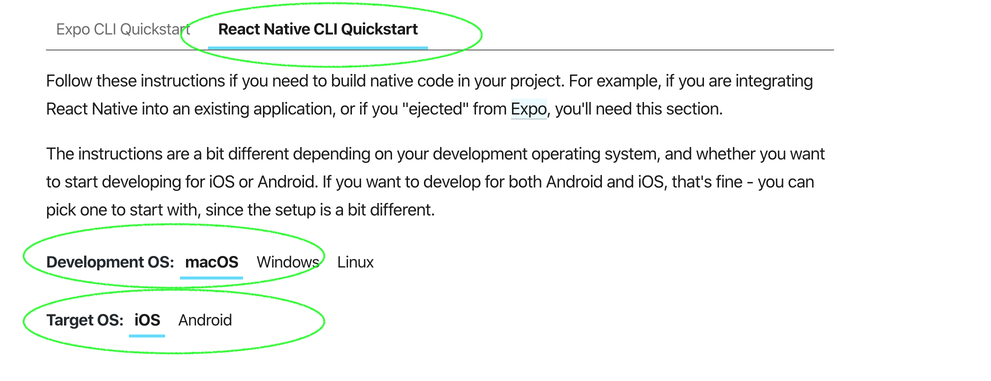
As shown in the picture above, we need to setup as React Native CLI Quickstart, not Expo option. MacOS platform is mandatory if Target OS is iOS. For android, macOS, Windows and Linux are available.
Node installation is mandatory for every platform and also, the Android platform requires Java and Android SDK installation. All of is available on this link
After React Native installation, with npx react-native init AwesomeProject --version X.XX.X (this command is available on the React Native document page) command, need to create new project.
The package name is com.mowega.mowegamarket. You should replace it with a suitable package name.
Install this plugin from here
react-native-rename "Your App Name" -b test.company.yourname with this command, you can change easily.
{
  "name": "mowegaMarket",
  "displayName": "mowega Market"
}
With the second method you can only make package names starting with com. For example, if the name is mowega Market, your package name is com.mowegamarket.
For the theme to work fully, plugins must be installed.
            "dependencies": {
                "react": "16.13.1",
                "react-native": "0.63.4",

                "@react-native-community/masked-view": "^0.1.10",
                "@react-native-community/netinfo": "^5.9.10",
                "@react-native-community/push-notification-ios": "^1.10.1",
                "@react-native-community/toolbar-android": "^0.1.0-rc.2",

                "@react-native-firebase/analytics": "^12.7.5",
                "@react-native-firebase/app": "^12.7.5",
                "@react-native-firebase/crashlytics": "^12.7.5",
                "@react-native-firebase/messaging": "^12.7.5",

                "@react-navigation/drawer": "^5.12.3",
                "@react-navigation/native": "^5.9.2",
                "@react-navigation/stack": "^5.14.2",

                "html-entities": "^2.3.2",
                "metro-react-native-babel-preset": "^0.63.0",
                "moment": "^2.29.1",

                "react-native-animatable": "^1.3.3",
                "react-native-datepicker": "^1.7.2",
                "react-native-device-info": "^7.4.0",

                "react-native-datepicker": "^1.7.2",
                "react-native-device-info": "^8.4.3",
                "react-native-gesture-handler": "^1.10.1",
                "react-native-image-viewing": "^0.2.1",
                "react-native-indicators": "^0.17.0",
                "react-native-keyboard-aware-scroll-view": "^0.9.3",
                "react-native-localize": "^2.0.2",
                "react-native-pages": "^0.9.0",
                "react-native-popup-dialog": "^0.18.3",
                "react-native-push-notification": "^8.1.1",
                "react-native-raw-bottom-sheet": "^2.2.0",
                "react-native-reanimated": "^1.13.2",
                "react-native-responsive-screen": "^1.4.2",
                "react-native-safe-area-context": "^3.1.9",
                "react-native-screens": "^2.17.1",
                "react-native-screens-swiper": "^1.1.12",
                "react-native-star-view": "^1.1.3",
                "react-native-status-bar-height": "^2.6.0",
                "react-native-svg": "^12.1.1",
                "react-native-vector-icons": "^8.0.0",
                "react-native-webview": "^11.15.0",
                "sync-storage": "^0.3.0"
            }
Above is the list of installed plugins in the package.json file. You need to install these plugins.
react-native-community/masked-view Go to plugin page
react-native-community/react-native-netinfo Go to plugin page
react-native-community/push-notification-ios Go to plugin page
react-native-community/toolbar-android Go to plugin page
react-native-firebase/messaging Go to plugin page
react-navigation/native Go to plugin page
react-navigation/drawer Go to plugin page
react-navigation/stack Go to plugin page
moment Go to plugin page
react-native-device-info Go to plugin page
react-native-status-bar-height Go to plugin page
react-native-swiper Go to plugin page
react-native-vector-icons Go to plugin page
sync-storage Go to plugin page
Our advice is to throw all the plugins into the package.json as json and then run the npm install command
Most important core component.
| Prop Name | Prop Type | Default Value | Other Values | Description |
|---|---|---|---|---|
| statusBar | boolean | true | true, false | to show statusbar. |
| title | string | null | "Test Title" | Page navbar title. Required navbar true |
| navbar | boolean | true | true, false | to show navbar |
| footer | boolean | true | true, false | to show footer |
| footerActiveIndex | Enum | 1 | 1,2,3,4 | index for detecting selected index |
| error | bool | false | true, false | to show error view |
| errorMessage | string | "" | to set error message that is in errorView | |
| errorOnPress | func | errorView button on click |
    <MyContainer
        title={"Categories"}
        footer={true}
        navbar={true}
        statusBar={true}
        footerActiveIndex={2}
        error={true}
        errorMessage={"en error occurred"}
        errorOnPress={() => console.log("error button pressed")}>

            {Other Components}

    </MyContainer>
This component is inside the MyContainer. No need to change. If you want to change it anyway, you can find it inside container.
All of react native TextInput props can use. You can access all of these from here You can find additional props below.
| Prop Name | Prop Type | Default Value | Other Values | Description |
|---|---|---|---|---|
| keyboardType | Enum | text | "default", "number-pad", "decimal-pad", "numeric", "email-address", "phone-pad" | It creates input-style structure in html |
| secureTextEntry | boolean | false | true, false | to hide entered text. It's kind of html password field and there is also show/hide icon on the right. |
| leftIcon | string | null | All vector icon | Adds an icon to the left side of the input. Requires Vector Icons plugin. |
| rightIcon | string | null | All vector icon | Adds an icon to the right side of the input. Requires Vector Icons plugin. |
| rightIconOnPress | function | null | null | to assign a function when click the right icon |
| leftIconOnPress | function | null | null | to assign a function when click the left icon |
| iconColor | string | theme mainColor variable | all colors | changes icon color. |
| containerStyle | style object | null | null | to change input container ui |
| textInputStyle | style object | null | null | to change textInput ui |
| placeholder | style object | null | null | placeholder text . |
| multiline | bool | true | true, false | to set input can be multiline or not |
| editable | bool | true | true, false | to set input can be editable or not |
| value | string | "" | null | input value |
| keyboardType | string | "default" | "default", "number-pad", "decimal-pad", "numeric", "email-address", "phone-pad" | to change keyboard type |
| secureTextEntry | bool | false | true, false | show/hide input |
| autoCapitalize | string | sentences | "none","sentences","words","characters" | to set input first letter as capitalize or others. |
| shadow | bool | false | true, false | to set input container shadow or not |
| type | string | "default" | 'default', 'small' | to set input type as default or small |
    <MyInput
        leftIcon={"user"}
        rightIcon={"user"}
        value={"number"}
        onChangeText={value => console.log("value")}
        iconColor={"green"}
        textArea={false}
        multiline={true}
        editable={true}
        keyboardType={"default"}
        secureTextEntry={false}
        autoCapitalize={"sentences"}
        shadow={false}
        type={"default"}
        containerStyle={{padding: 5}}
        textInputStyle={{color: "grey}}
        rightIconOnPress={() => console.log("rightIconOnPress")}
        leftIconOnPress={() => console.log("leftIconOnPress")}/>
You can find required plugin from here. The global variable is used in this component. It comes in a way that is installed in MowContainer. To use this component;
    // screen
    export const HomeScreen = (props) => {
         const {isLoading, loadingText, showLoading, hideLoading} = useContext(LoadingContext);
    }
| Prop Name | Prop Type | Default Value | Other Values | Description |
|---|---|---|---|---|
| title | string | null | null | list title |
| textStyle | style object | null | null | to change title style |
| subtitle | string | null | null | sub title that below the title |
| subtitleTextStyle | style object | null | null | to change sub title style |
| imagePath | require('path') | null | null | list item image that appears the left of the view |
| imageUrl | url | null | null | list item image that appears the left of the view |
| iconName | Fa icon (string) | null | null | Right side > icon. It can change from here. |
| selected | boolean | null | true, false | If you want to set as selected when clicked/touched |
    <FlatList
        showsVerticalScrollIndicator={false}
        keyExtractor={(item, index) => index.toString()}
        data={CategoriesData}
        style={[pageContainerStyle]}
        renderItem={({ item, index }) => (

            // category item
            <MyListItem
                key={index}
                style={{marginVertical: 5, borderRadius: 5}}
                onPress={() => {  ... when clicked  }
                imagePath={item["image"]}
                title={item["title"]}/>

    )}/>
| Prop Name | Prop Type | Default Value | Other Values | Description |
|---|---|---|---|---|
| pickerVisible | boolean | false | true,false | Open/Close picker. |
| pickerOnClose | function | null | null | IMPORTANT! when onClosed, in which page you call modal, you must set the modal opening state parameter to false in the state of that page. This is important when use two modal in one page. |
| search | boolean | true | true, false | to enable search bar |
| searchKey | string | "title" | null | to set search key |
| data | array | null |
|
data that will list inside picker |
| onSelect | function | null | null | when selection is made, returns the clicked data as json. |
    <MyPicker
        pickerOnClose={() => this.setState({pickerVisible: false})} // IMPORTANT
        pickerVisible={this.state.pickerVisible}
        search={false}
        data={pickerSortData}
        onSelect={(obj) => {this._onSelect(obj)}}/>
| Prop Name | Prop Type | Default Value | Other Values | Description |
|---|---|---|---|---|
| buttonText | string | null | null | button name |
| containerStyle | object | null | {backgroundColor: red} |
It changes button ui. Any style can import. |
| textStyle | object | null | {color: blue} |
It changes text ui. Any text style can import. |
| rightIcon | string | null | null | Feather icon set as default. Vector Icons library is required. |
| leftIcon | string | null | null | Feather icon set as default. Vector Icons library is required. |
| shadow | boolean | true | true, false | Set a shadow to button |
    <MyButton
        buttonText={"Button Text"}
        containerStyle={buttonStyle.container} // Button outside style
        textStyle={buttonStyle.text} // Button text style
        leftIcon={"google"} // left icon that can be changed. Required library https://github.com/oblador/react-native-vector-icons)
        rightIcon={} // right icon that can be changed. Required library https://github.com/oblador/react-native-vector-icons)
        shadow={}// boolean => enable the shadow
        filled={} // boolean => makes the button filled
    />
You can find required plugin from here. The global variable is used in this component. It comes in a way that is installed in MyContainer. To use this component, you can follow below code blocks. This component is used by calling the function.
| Arguments | Data Type | Default Value | Other Values | Description |
|---|---|---|---|---|
| title | string | "" | Dialog Title | |
| message | string | "" | Dialog Description | |
| bpt | string | "OK" | ButtonPositiveText. Positive button text | |
| bnt | string | "Cancel" | ButtonNegativeText. Negative button text | |
| twoButton | boolean | false | to show both positive and negative buttons. | |
| close | boolean | false | to show dialog close button. |
    warningDialog("mowega Market Theme", "Message",null,false, false);

    successDialog("mowega Market Theme", "Message","OK","Cancel",true, false);

    errorDialog("mowega Market Theme", "Message","OK",null,false, true);

    defaultDialog("mowega Market Theme", "Message","OK",null,false, false);
| Prop Name | Prop Type | Default Value | Other Values | Description |
|---|---|---|---|---|
| checked | boolean | false | true, false | Set checkbox as selected. |
| containerStyle | style object | null | null | Changes container style. |
| checkedColor | string | mainColor | null | Set checkbox selected color. |
| onPress | function | null | null | Function that required for each click operation. |
| boxSize | integer | hp(2.5) | null | It is recommended to give according to the screen ratio. |
| text | string | "Checkbox Text" | null | Checkbox text value |
| textStyle | object | {} | null | Changes text style. |
| numberOfLines | number | 1 | 1 | Number of text lines. |
     <MyCheckBox
            onPress={() => {this._onPress()}}
            checkedColor={myColors.mainColor}
            checked={this.state.checkboxChecked}
            containerStyle={{alignSelf: "center", right: wp("5%")}}/>
Calls as function. It takes two parameters. First one is text that shows on the screen and second one is duration. The time is 1500 millisecond as default.
     ShowToast.success("Success",2000)//text , duration
     ShowToast.info("Info",2000)//text , duration
     ShowToast.warning("Warning")//text , duration
     ShowToast.error("Error")//text , duration
| Prop Name | Prop Type | Default Value | Other Values | Description |
|---|---|---|---|---|
| checked | boolean | false | true, false | Set checkbox as selected. |
| containerStyle | style object | null | null | Changes container style. |
| checkedColor | string | mainColor | null | Set checkbox selected color. |
     <MyTitleView
        title={"Transactions"}
        buttonText={"All"}
        buttonOnPress={() => {console.log("button pressed")}}/>
The service where the router parts of the application are set. The first part of the application. If you want to make changes to the application, first take a look at this section
All pages within the application are in this folder. Login and non-login are separate.
All sample data within the application is here.